Demo Driven Development
Building components alongside an isolated demo surfaces issues that testing alone misses. A component that passes its unit tests might still freeze when an API call hangs, or fail to provide any way to retry after a network error.
When you can see and interact with a component outside your app, you naturally try things you wouldn’t write tests for—clicking buttons in unexpected sequences, resizing the window, tabbing through fields in unusual orders. This exploratory approach catches edge cases that scripted tests miss.
This article covers how to build components in isolation, how to promote exploration and interaction, and how to demonstrate failure scenarios that reveal real-world brittleness.
Key ideas
- Demo every component — atoms, molecules, screens; if it renders, it should have a demo
- Build in isolation — develop and verify components outside the target app
- Mock all data — realistic data with delays, failures, and edge cases
- Promote freeform testing — interactive demos catch issues that scripted tests miss
- Demonstrate failure states — loading delays, network errors, retry flows
Build in Isolation
When writing components, it’s good to start with a Storybook example, rather than building directly within an app. I tend to create both the component and Storybook files at the same time as one another. As you’re refining the component, you can also be fleshing out any relevant mock data and functions (see API Mocking Pattern for React and Storybook for more information).
Rather than just limiting this to atoms, it is good to build up and repeat the same for molecules and even screens.
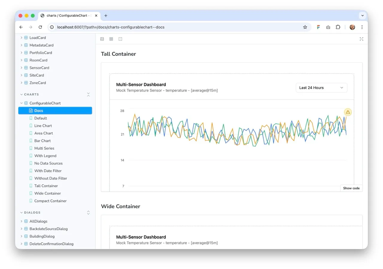
Freeform Testing
Stories capture specific scenarios—empty states, loading states, error states. These are valuable. But they show isolated moments, not transitions. Freeform testing is about manipulating components through sequences of state changes to find issues that only surface after multiple interactions.
Use Storybook’s interactive controls to enable dynamic manipulation:
- State toggles — switches for loading, disabled, error states that you can flip repeatedly
- Action triggers — buttons to add items, delete items, clear lists, trigger errors
- Size controls — sliders to resize the component while it’s running
- Text inputs — fields to change prop values on the fly
The value isn’t testing each state in isolation—it’s testing transitions. These sequences reveal issues that isolated stories miss. A list component might render correctly when empty and when populated, but break when you clear it after adding items.
Keep your scenario-based stories—they’re still important for documenting expected states. Add controls on top to enable exploration of state transitions and compounding interactions.
Demonstrate Failure States
Most components are built and tested under ideal conditions. API calls succeed. Data arrives nearly instantly. Networks never fail. This creates brittle UIs that don’t handle reality well.
Your demos should include failure scenarios:
- Loading delays — what happens when data takes 5 seconds to load?
- Network failures — what happens when the API returns a 500?
- Partial failures — what if half the data loads successfully?
- Recovery flows — can the user retry without refreshing the page?
For many components, these states can be obvious and well considered. But when you turn off your internet connection, it can be surprising just how many components end up failing with no way to recover. For example, you might have a network-backed select input that becomes stuck.
Ensuring every component has a demo with an error case helps verify the system can recover.
Example: Select with Remote Data
Consider a select component that loads options from an API:
// stories/Select.stories.tsx
export const LoadingState: Story = {
  parameters: {
    mockData: {
      '/api/options': {
        delay: 3000,
        response: { options: [...] }
      }
    }
  }
};

export const NetworkError: Story = {
  parameters: {
    mockData: {
      '/api/options': {
        delay: 1000,
        status: 500,
        response: { error: 'Internal server error' }
      }
    }
  }
};

export const RetryAfterFailure: Story = {
  parameters: {
    mockData: {
      '/api/options': [
        { delay: 500, status: 500, response: { error: 'Failed' } },
        { delay: 500, response: { options: [...] } }
      ]
    }
  }
};
These stories force you to handle scenarios you’d otherwise discover in production. The RetryAfterFailure story is particularly valuable—it verifies that your component’s retry mechanism actually works.
Coverage Across Component Hierarchy
Demo every level of your component hierarchy:
- Atoms — buttons, inputs, badges in all states (default, hover, disabled, loading)
- Molecules — forms, cards, dropdowns with valid data, empty states, error states
- Organisms — navigation, sidebars, data tables with various data sets
- Screens — full page layouts in different states and user contexts
This comprehensive coverage ensures that when you compose smaller components into larger ones, you’ve already verified each piece works independently.
Not a Replacement for Tests
Demos complement testing but don’t replace it. Tests are better for:
- Regression prevention — ensuring known issues don’t reappear
- Automated verification — running on every commit without manual intervention
- Specific assertions — checking exact output values or behavior
Use both. Tests verify specific contracts. Demos enable exploration and catch the issues you didn’t anticipate.
For strategies on testing components with these demos, see E2E Testing with Playwright and Storybook.